|
draw ‘til you’re soreWelcome to the bog of Jessica Amber. Herein you’ll find my life, whatever Irandom stuff ’m getting up to. It’s usually creative.
Unmaintained since 2019. Please go to www.jessicaamber.com.au This site contains affiliate links.
|
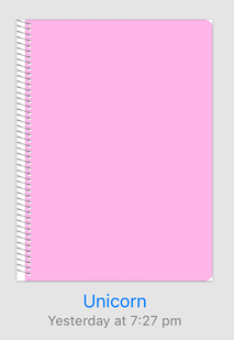
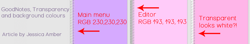 I make downloadable journal covers for the GoodNotes app (which can be used in other apps, considering they are just PNG files). I like journals with rounded corners, and attempt to emulate that in my designs. However, once the covers are imported, they don't look exactly as I would like. The notebook covers in have a very defined bounding box with square corners and a drop shadow, that is visible no matter what type of graphic you import. There is also no support for transparent templates. Any such image would have the transparent areas turned white. You can see this effect in the following image.
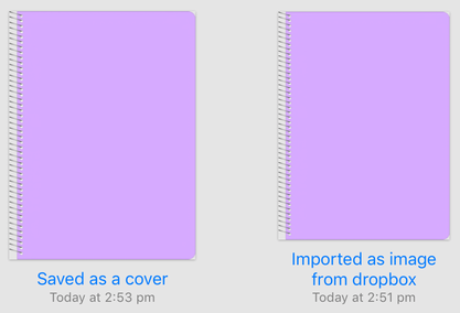
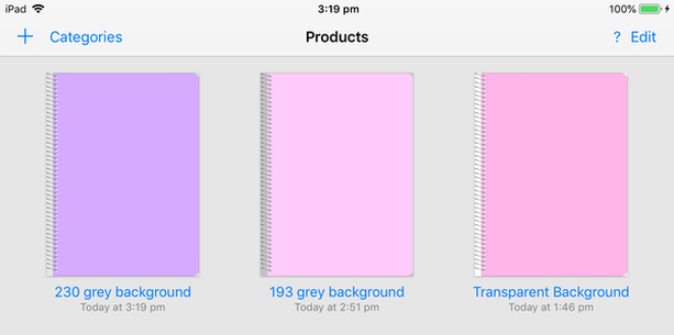 The next image shows a cover with a background of 193, 193, 193 RGB. As you can see, in the main menu it looks too dark, not blending in with the 230 grey background. But when viewed in the editor, it is the right shade of grey to match. 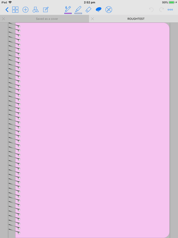 So, what is the appropriate course of action? Which is more important, matching the menu or the editor backgrounds? Or is transparency the answer we seek? It is for me. If GoodNotes supported transparency and got rid of the visual bounding box, it would improve my use of the app and my ability to sell products for it. This is mainly because, in the current state of things, I have to upload 2 sets of files. One as transparent PNG, mainly to support other notebook apps besides GoodNotes. And one with background 230 grey, to look good on main menus. With today's realisation of the 193 grey backgrounds in the editor, I don't know whether to change my grey background policy or not. I will be sending a message to GoodNotes about my concerns though.
I am not the first person to have an interest in this feature. Six voters asked for it as of 2015 on the GoodNotes feature request forum. What do you think? Do you want transparency support? Do you prefer the covers blending with the main menu or the editor? Let us know in the comments! Until next time, xx Jess
0 Comments
Leave a Reply. |
AuthorI'm just some Aussie 20-something year old with a lot of time and a lot of interests. Archives
July 2019
CategoriesAll Art Art Freelancing Business Cosplay Food Law Of Attraction Makeup Organizing Sewing Shopping TAFE Technology Web |
 RSS Feed
